What are Aesthetic Preferences?
Let's start with Romantic Country Cottage.
When I first started writing about this idea, I used Etsy treasuries to demonstrate the visuals. Then I started building Pinterest boards. Since I wrote this the concept of “something core”, like “Cottage Core” has gained traction. I think a “Core” is pretty much an aesthetic preference.
I coined the concept of “Aesthetic Preferences” to mean people’s taste and the kind of home decor, literature, clothing, visual arts and performing arts that lifts their spirits, makes them feel comfortable and beautiful, and ignites their creativity. Essentially it is the style people prefer.
I started listing them and came up with about 20, but I think there could be more. Some the really visible or prevalent ones popular today include Shabby Chic, Steampunk, and Modernist. Others include Traditional, French Country, Cottage, Prim, Mid-Century Retro, Craftsman, Shaker, Tribal, Beach and Asian.
Aesthetic preferences are a continuum, sliding from one to the next in eclectic moments. Just as nobody likes only one kind of cuisine, as far as I can tell, nobody likes only one aesthetic style. People will respond positively to more than one, and most likely they will be influenced by how “well realized” the style may be. But people’s preferences change with time, with personal maturity, with lifestyle changes, even with fashion.
As a film and theater designer I often had to work with multiple aesthetic styles to reflect the characters, sets, locations. Scripts and plays would be part of an aesthetic, that informed the design.
But why should you concern yourself with defining your own aesthetic preferences?
Exploring images always inspired my creative thinking. You too can be inspired just by researching. Discovering your own Aesthetic Preferences can help your creativity by giving definition to your plans. If you want to make something for yourself or your home, you have a starting point.
Understanding other people’s aesthetic preferences will help you when you want to make or buy something for them. It can also help you define your target market if you are in business.
Examining your aesthetic preference could lead you to find your creative blocks or fears. Do you find some aesthetic overwhelming, or too hard to realize? Do you fear that you will be judged for your preferences or taste? Examining aesthetic preferences can give you a clear idea of what you don’t like, in the quest for deciding - and expressing - what you do like.
As we move forward with different AP’s, think about the fundamentals of each one, to discover the principles and criteria that define the AP - then they can be applied to your other work, other media.
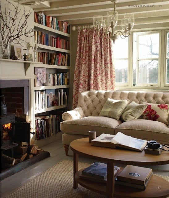
Aesthetic Preference #1 - Romantic Country Cottage. I rather think this is what they mean when they say “Cottage Core”, leaning to shabby. Here’s my Pinterest Board.
Mix cabbage roses, liberty prints and chintz. Tea in cups. Favorite author: immortal Jane Austen, but also some Tolkein, Wodehouse, Shaw. Miss Marple, not Poirot. Old Merchant/Ivory before Helena BC went all Tim Burton. Cold Comfort Farm (at least in hindsight - the book itself is meant as a parody of rural-set romance novels.) Herbs and lavender. Think of toile printed fabric - there’s that Jane Austen again - and old leather bound journals too, lace collars and Irish linen with sprigs embroidered. Little House bonnets and pinafores. Vintage Holly Hobbie in pen and ink.

Core Concept: Nostalgia. At one end Romantic Country Cottage sits next to charming Chinoiserie with painted turquoise tea cups or blue and white china; at the other it creeps towards Art Nouveau and looks over the hedge at Craftsman. Bleach the chintz (lessen the contrast) and it fades to Shabby Chic. One of the aspects of this that sets it apart from the much newer aesthetic neighbor, Shabby Chic, is brighter color and greater tonal range - more contrasts.
The idea is to choose related prints in close color ways but in different scales to create variation in texture. Simpler two tone textures, like stripes or ticking, create rests for the eye. The colors featured are usually pastels mixed with gelato brights, but with some darker shades of the core colors. There will often be a sense of depth.
As far as scrapbooking, there is so much very pretty vintage look floral paper, so many borders, embellishments and pearl button stickers, that it’s actually very easy to achieve. Most people tend to want to take it distressed, and that’s perfectly fine. Make it masculine with earth tones and navy blue, add ticking stripes and more of that brown leather. “A River Runs Through It” to Americana.
Is this your favorite style? Do you love overstuffed sofas in chintz with mismatched throw pillows, and walking through an overgrown wildflower garden wearing a big hat and thinking of Marianne Dashwood? Sweet teacakes on a floral platter, and butternut squash soup in a tureen. And pretty aprons!


